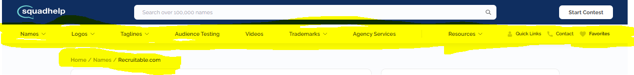
S-help takes up too much space at the top advertising its own services. Many of us invest a great deal in listing domains here and the focus should be on selling the premium domain – not on selling S-help’s branding services.
To elaborate on this: many domains, particularly higher quality names, are sold via type-in traffic. A domain landing page should be clean and simple, focused on serving one purpose: converting the sale. Adding a bunch of upsell services at the top is confusing and dilutes the sales presentation. The effect is likely to take more buyers into the S-help site or increase confusion and bounce rate vs. simply converting the sale. This could result in a large number of lost sales.
Most of the yellow highlights should be removed. I didn’t highlight the “start contest” button – that should probably be removed, too, for the same reason – it is a sales-conversion killer.
The separate line for Home / Names / (domain) is unnecessary and takes prospective buyers away from the current name, encouraging them to browse other options. Again, a domain landing page should be designed to convert the sale – not to encourage browsing or discovery of the S-help suite of services.
The descriptions no longer have spacing between paragraphs. No one wants to read a single chunk of text.
I totally agree with @brandlander. At least for the moment this upgrade is a serious downgrade. Visually- less appealing for sure. The overall look, the new font- not good. It looks “cheap”. That menu at the top is a terrible component to have on landing pages. I honestly don’t know if I’d be adding new names if that menu stays on landing pages and I’ve seen other domainers with the same sentiment. ‘Start Contest’- same thing. It shouldn’t be at the top of a landing page for a domain. For the past two years or so SH has been getting almost everything right, at least from my perspective. I can’t commend you guys enough for all the innovations and fantastic all around product and service. I hope you guys can backtrack from these changes, get back to the drawing board and readjust.
I will support my colleagues. Current pages look terrible and are detrimental to potential domain sales. I already wrote that at first I thought it was a mistake. Hopefully the team will listen to our words and return the previous interface.
I’ll just add that sending people from contests to the marketplace is logical. It’s a potential for making more money and giving contest holders more options. But the other way around, sending people from the marketplace to contests or from individual landing pages to contests- isn’t. Selling domains should be isolated from alternative options as much as possible. Every landing page should be a sales funnel for converting leads into domain buyers. People need to be encouraged to buy the name they landed on or find the right name within the marketplace. They shouldn’t have a ‘Start Contest’ button glaring at them from the top of every landing page, basically encouraging them to pay much less. Effectively, by having that huge button there, placed so prominently, domains are being used as bait to get more customers for SH’s contests from type-in traffic. Not cool.
The new look seems to be focused on driving customers and neglected the creatives. Definitely way more challenging to navigate and not intuitive at all.
Thanks everyone for the feedback. For the next few weeks, we will continue to do significant level of A/B testing for all UX changes which means that different users may see different versions of the website.
We will continue to make additional adjustments to our UX based on these tests as well as ongoing feedback. Marketplace sales growth is an important strategic priority and we are closely monitoring and making adjustments with that goal in mind.
One of the important feedback we had received from many buyers was that the navigation menu was not consistent on different pages of our website, which led to confusion, Now that we have moved to a consistent navigation across the entire website, we are now in the next phase of testing various menu options and call to action buttons.
Another important consideration for this change was to introduce a global search box across all pages so that buyers can easily search for Marketplace names from any section of the website leading to a much greater discovery of marketplace names than before. Regarding the “Start Contest” button, this existed in the previous navigation as well however we plan to test few different options in this section and will likely make additional adjustments.
A domain landing page is not a standard site page. Often, traffic goes directly to the domain landing page first with the intent to buy.
The domain landing page should be minimal and clean to help convert the sale rather than adding distracting links at the top that take buyers away from the name.
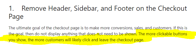
The first rule of checkout page optimization is to simplify:
Thanks for the reply. In regard to the ‘Start Contest’ button, I checked the previous version now. And yeah, the button was there. But it didn’t stick out the way it does now. In the new version that button is isolated at the top of every page. Again, I think it shouldn’t be there at all in marketplace pages. Once you have a potential buyer in the marketplace you want to keep them there. As Brandlander pointed out it’s basic selling strategy. Perhaps to SH it doesn’t matter because SH doesn’t care whether it sells a visitor a contest or a domain, but to domain sellers- it does matter.
The search bar on all pages is a good idea so thumbs up on that.
As for the menu- IMO it shouldn’t be there in marketplace pages, for the same reason as the button. I looked now and the previous version of that menu bar was at least minimal. It’s now become a monster bar with dozens of links. I think you guys have to remember that sellers are giving you exclusivity and usually a 25%-35% cut and in many cases, you also benefit from type-in traffic. Any other brandable marketplace focuses on selling domains and each landing page is devoted just to that. Squadhelp is juggling contests and domains and wants them to cross promote each other but perhaps in the process it forgets that quite a lot of the traffic is generated by the seller owned domains. Why should domain owners contribute type-in traffic to SH’s contests or promote its other services instead of listing elsewhere? No offense to SH’s contests which have their place, but it seems like they contribute to very few domain sales from the marketplace. I’ll have to think more about all of this but perhaps I need to move more domains from the premium marketplace to the WLM.
Uniregistry, Dan, Godaddy, many have done extensive testing about what converts on a landing page. All have by large margin come to the conclusion that less is more. A minimalist approach creates more assurance about what’s going on and clearer paths to action. It’s like a checkout page, you don’t want to create ways to leave it without closing the tab.
I’m also certain that more navigation options will lead to less conversion. Not keen. Thank you.
I just wanted to chime in and share some of my thoughts. First of all, thank you for all your feedback. We have made some adjustments, and will continue to make additional changes based upon our ongoing A/B testing.
Testing and rapid iteration is part of our DNA and this is how we have evolved over the last several years. Instead of staying comfortable with the status quo, we do not hesitate to try new concepts even if they might not work as expected. If the new ideas do not pan out, we rapidly make adjustments so that we can continue to improve every day.
The navigation section on landing pages was not added so that we can benefit from the type in traffic and sell other SH services to those visitors. There are benefits to having a common navigation across all pages of the website, and as Grant had mentioned, this was our first step from a series of planned steps to improve our UX.
We do agree that minimizing distractions on a landing page is generally a good idea which is why we are currently testing a simpler version of the landing page navigation.
On a broader note, I would also like to mention that there are several services and aspects of SH platform that complement each other in a way that helps deliver more sales in the Marketplace. We acquire customers through many of these services, and lead them towards the domains for sale.
At the end of the day, our premium marketplace is a discovery platform for brandable domains - it is not ideal for those domains which already receive ongoing buyer interest on their own via Type-in. Therefore, if you have names that are receiving inquiries or buyer interest on their own, it is better to use a non discovery focused landing page solution such as WLM to list those names so that you can avoid paying higher commissions.
An important thing to keep in mind is that our incentives are directly aligned with domain sellers. We want to maximize the sales in the marketplace as much as the sellers do, because this is an important aspect that fuels our business growth. Growth is important because it allows us to reinvest the funds back into additional marketing and tech, which ultimately helps generate even more sales. Having said that, we also want to make sure that other aspects of our platform are not ignored, because they are an important part of our eco system.
Darpan, thanks for the detailed clarification! A separate request - please review domains approval policy for the premium market again! Statistics show how successful sales through WhiteLable are; so maybe many domains are undervalued by the team … Give them a better chance please!
the winner button overlapping search on my device super hard for a clear hit without a redo. Login is tough ad well and I hate that I have to hit more than one button to get to marketplace alsowish I could see if I have cash in a count without searching all over, it used to come up on sign in
@Darpan Thanks for taking the time to address these issues and for the explanations. I also saw that you guys are hiding the menu and the ‘Start Contest’ button on landing pages at least for now and that’s appreciated and I hope it’ll remain.
While I understand the request by buyers to have common navigation across SH and SH’s desire to have that- you have hundreds (maybe thousands) of sellers who are pointing their domains to SH and are giving SH exclusivity, big chunks of sales and also type-in traffic, whether it’s a little or a lot. And that won’t change regardless of which domains are on the platform. One type-in visitor who thinks of a name and wants to see if the domain is available can mean the difference between a sale and no sale for a seller. Sellers don’t want potential buyers to launch contests. They want them to buy a domain. There are some sales as a result of contests but I’d be very surprised if you’d tell me these sales are the majority of all sales or anywhere close to that. Contests have no budgets for marketplace purchases. Creatives are submitting blindly, on the off chance a CH won’t find a viable option in the contest and on the off chance they’d decide to reach into their wallet and add much more money than they intended to pay. I’m quite confident that the majority of sales are from people browsing the marketplace, from advertising and from direct traffic and not from contests. But correct me if I’m wrong.
While the ‘Start Contest’ button and the dozens of links in the menu that send people all over Squadhelp may have not been intentionally designed in order to “take” traffic away from landing pages, having them there is almost like telling sellers- this is all about SH and SH making money one way or the other. SH wants to sell contests and/or domains and/or other services, so it’s going to advertise its services everywhere, including on the landing pages of your domains, at the top of each page in a place that’s impossible not to see. Knowing what Squadhelp offers is very easy and most buyers who will consider buying a domain will probably check out Squadhelp.com anyway. So inadvertent “advertising” on landing pages for the sake of common navigation may be helpful to buyers and to SH, but it simply isn’t fair to sellers.
I think you guys have to walk a fine line between being a domain marketplace and being a place for contests. They complement each other in some ways but compete in other ways. The marketplace is an upsell for contests. It doesn’t work the other way around. A marketplace works best when there are as little distractions as possible. A competing offer for another naming solution with a call to action “advertised” at the top of the landing page is the last thing that should be there to help close a domain sale. Anyway… way over my word quota as usual. Thanks again for listening to sellers’ feedback and continuing to be committed to innovation and adjustability.
When I load the page, this small line of text is the first thing I see.
It contains links that encourage further browsing of the SH marketplace.
It’s an unnecessary distraction that takes up valuable above-the-fold space. On a domain landing page, the premium space above the fold should, in my view, be dedicated as much as possible to spotlighting the domain for sale with the logo, price, and BIN button.
Anything more complicates the process and makes it more difficult for buyers who land on the page to check out.
Just one thing on WLM versus SH Premium. It’s not a straight line. Some list names as Premium that would be well off ”on their own” (WLM).
The reason for that is that maximizing exposure is good - across the line.
Others list names on WLM that are not a good fit for the Premium marketplace. That in itself does not mean that they are a good fit for WLM.
I also have to ask if this is what you mean by what you say, because it’s counterintuitive to me to have a Premium marketplace where presumably higher value or more easily sold domains are listed, and then to say that precisely those names (that have the potential to sell themselves) should be on WLM.
I’m saying it’s a spectrum. Even though some names have more potential to sell on their own does not mean that they don’t have even more potential to sell when marketed. Infact I think that having both components is where it’s at.
The only clear arbiter for me between WLM or not is if it’s an outright descriptive name, because that is not your avenue.
I absolutely agree that additional marketing and exposure can help all domains and I also agree that it is not a straight line. My only point is that if you decide to list the domain in the premium/ brandable section, then it is important to allow us to use the entire machinery in the SH ecosystem to help promote the name. The navigational elements and other sections on the landing page are there because we have data that suggests they help in improving overall sales in the Marketplace. This is an ongoing process, and as we do additional tests or see more data, we will adjust accordingly. For example, showing other services on the landing page, can potentially be distracting so for now we are testing a version without those services and only with basic navigational elements that are important for the discovery process.
The premium section is not a good fit if you are looking to lock down every navigational path in the landing page and take away the buyer’s ability to explore other names. More than 8 out of 10 buyers who visit a landing page in our premium marketplace are still in a “discovery/ research” stage. Therefore, allowing reasonable navigation and recommendations are important so that they can continue to explore other options and move closer and closer to the purchase path.
On the other hand, the WLM ensures that the buyer stays more or less in your own ecosystem, which can avoid any potential “leakage” but at the same time, it can significantly reduce the exposure. Therefore, the WLM typically only works well in those situations where customers are likely to come up with the name themselves, and go straight to the landing page by typing it in the browser.
@Darpan Potential buyers who reach the marketplace, no matter how they got there, should be encouraged to stay in the marketplace and buy a domain. I think they should have a great navigational path inside the marketplace- categories, recommendations, the works. Maybe also an ability to navigate to domains by the same seller. They should browse to their heart’s content and find the best possible name and domain for their business. Then everybody wins- SH gets its commission, a seller gets a sale and the buyer gets what they want. If a visitor gets to SH via a domain they typed in, and ends up choosing another domain from the marketplace- c’est la vie. Maybe some other time the seller who missed out on that sale will get a sale using somebody else’s lead. The contests are a tool in the SH eco system that can contribute to sales as additional options suggested to contest holders. However, they’re not a tool that should be used to “downgrade” a potential domain buyer who’s already in the marketplace and turn them into a contest holder (who will likely not buy a domain) or into a visitor who will start exploring Squadhelp’s services immediately after they arrived instead of exploring the marketplace first. A potential domain buyer turning into a contest holder or a wondering visitor can happen organically anyway, but sticking a neon sign above every domain with a call to action saying ‘Start Contest’ or providing elaborate navigation leading down the rabbit hole of SH’s services and away from a specific domain and/or the marketplace is counterproductive and unfair to sellers. So great navigation- sure. Just not the sort of navigation that benefits only SH and its customers but not your partners- the sellers.